KyClick — Cloud Telephony Redesign
KyClick offers cloud telephony for small businesses — but their site made it feel complicated. I redesigned the website to reduce cognitive overload, clarify the product offering, and create a conversion-focused experience for non-technical buyers.
Role
UX/UI Designer
Timeline
4 weeks
Tools
Lovable · Cursor
Type
Website Redesign
The Challenge
The site was built around product features, not user questions.
Small business owners landed without a clear understanding of: "Which service is actually right for my business?"
"Users struggled to quickly understand which service matched their needs."
Jargon-heavy messaging
Technical telephony language created confusion for non-technical users.
Unclear service hierarchy
Users couldn't quickly understand the difference between plans and services.
Feature-heavy experience
Too many equally weighted features made the core offering harder to understand.
Weak value communication
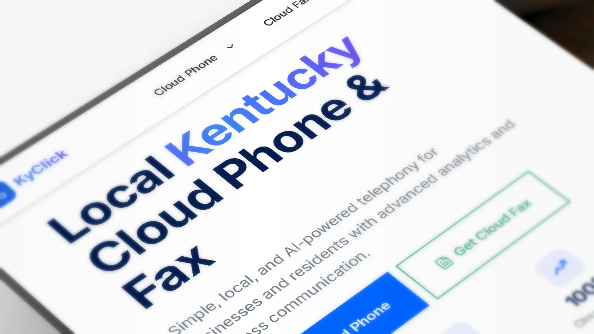
The homepage lacked a clear explanation of the product's main benefit.
UX Audit & Key Findings
Information Architecture
Navigation was organized around features instead of user needs, making core services harder to discover.
Competing Actions
Multiple CTAs competed for attention, making the primary action unclear.
Visual Hierarchy
Headings, content, and CTAs carried similar visual weight, reducing scanning clarity.
Unclear Value Proposition
The homepage explained the product category, but not the main user benefit.
IA Improvements
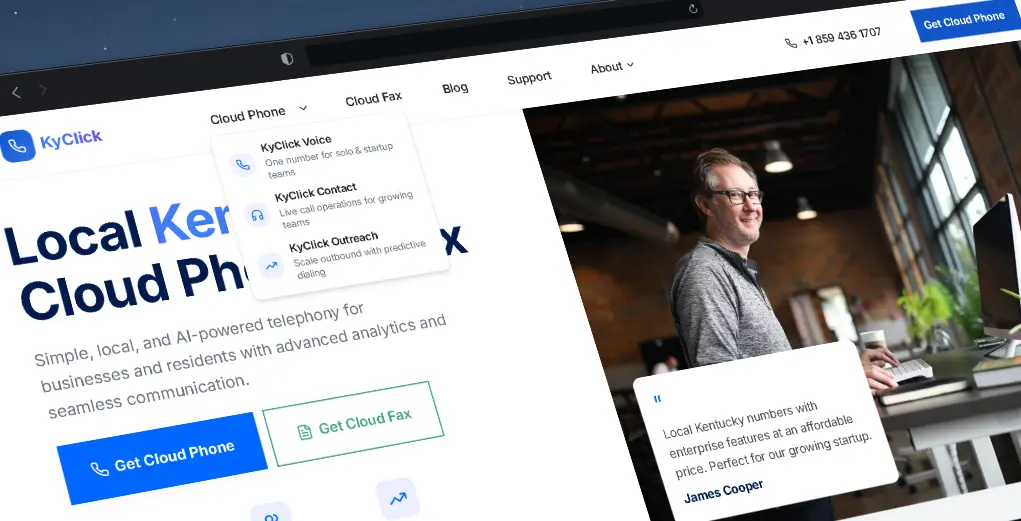
Core services moved into main nav — no more dropdown hunting
Services grouped by user need, not product category
14 pages reduced to 8 — each with a single clear purpose
Conversion flow made visible at every step of the journey
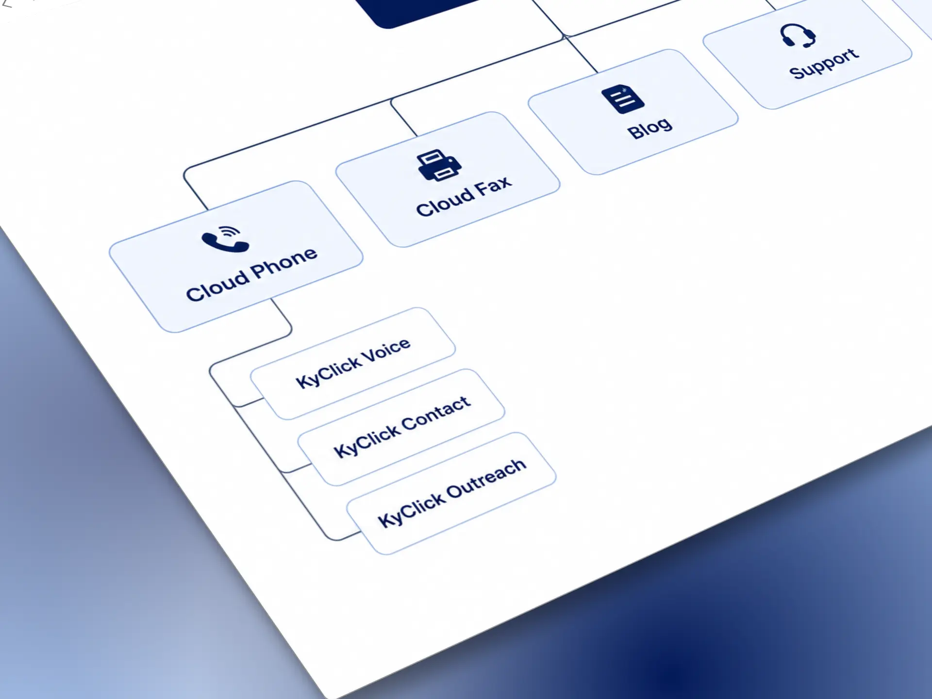
Revised sitemap
Simplifying Complex Services
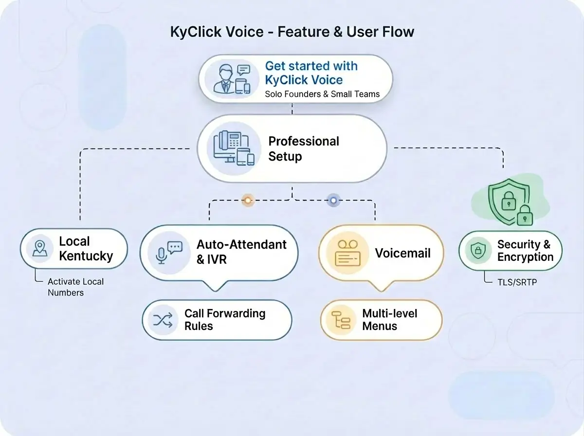
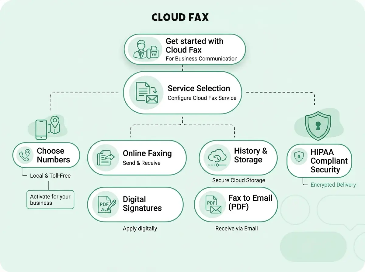
Many small business owners were unfamiliar with cloud telephony terminology. Visual user flows were introduced to explain how each product works in a simple and accessible way, helping users quickly understand service benefits and communication flows without technical overload.
KyClick Voice
Cloud Fax
Process
UX Audit
Reviewed the existing website structure, navigation, and product communication to identify friction points and usability issues.
Information Architecture
Reorganized navigation and service grouping to make core products easier to discover and understand.
Wireframing & Content Structure
Explored clearer layouts, simplified messaging, and more focused conversion flows for key pages.
Visual Redesign
Refined the interface with improved hierarchy, cleaner SaaS presentation, and more accessible product communication.
Key Design Decisions
Simpler Product Structure
Reduced unnecessary pages and reorganized features into clearer service-focused navigation.
Clearer Navigation Flow
Primary actions stay visible while secondary actions were reduced to create a more focused user journey.
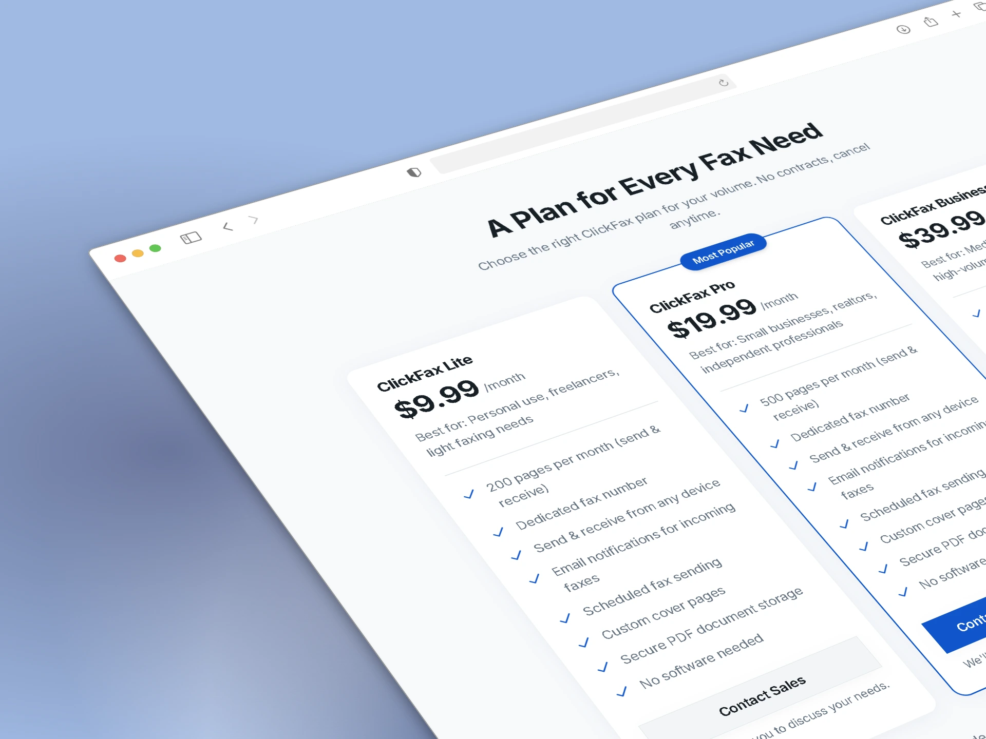
Trust Before Pricing
Social proof and setup clarity were introduced before pricing to build confidence for small business users.
Simpler Product Communication
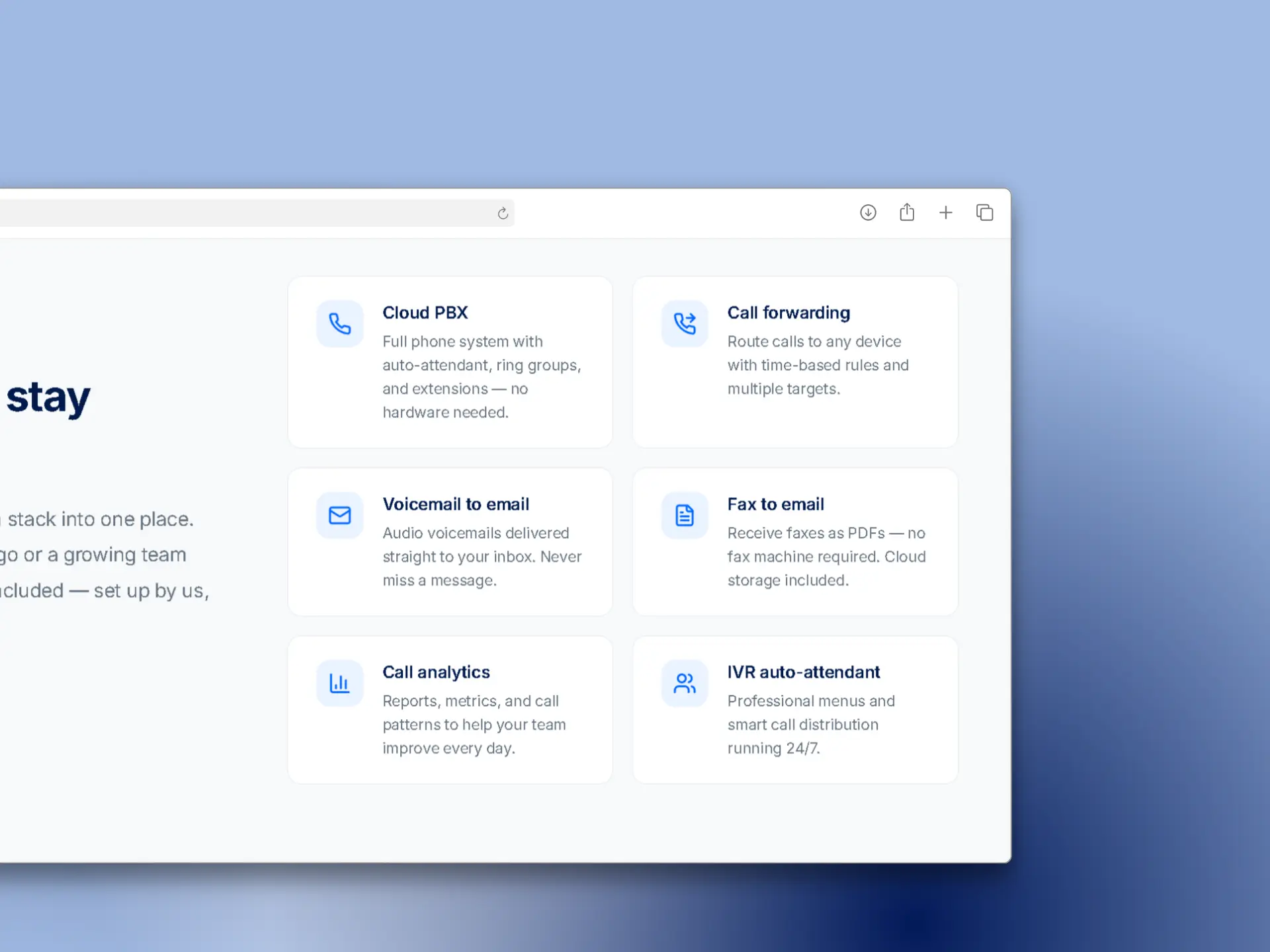
Technical messaging was simplified to make cloud telephony easier to understand for non-technical users.
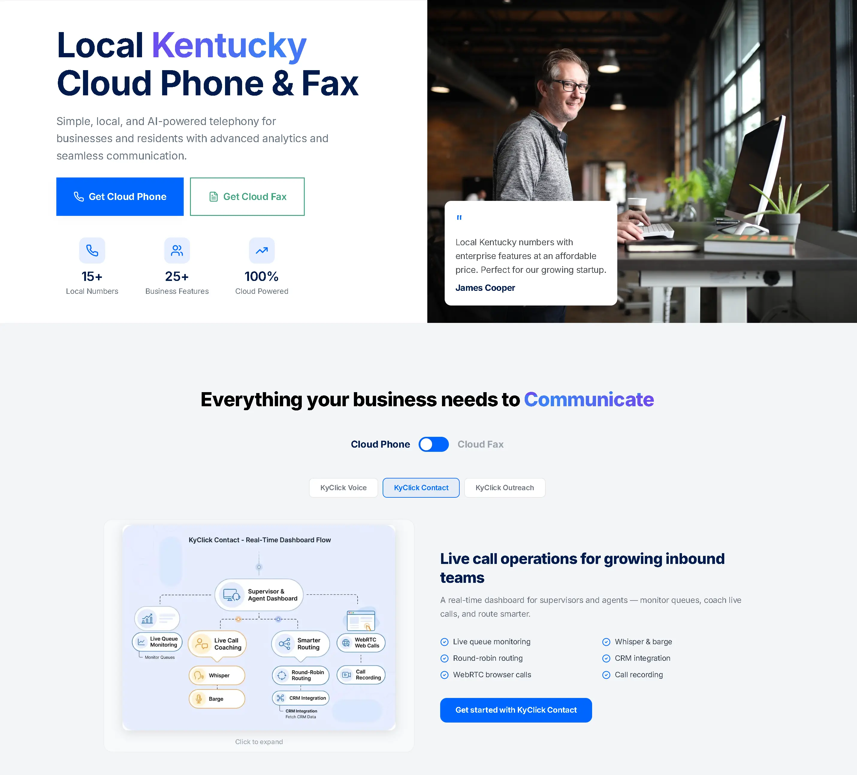
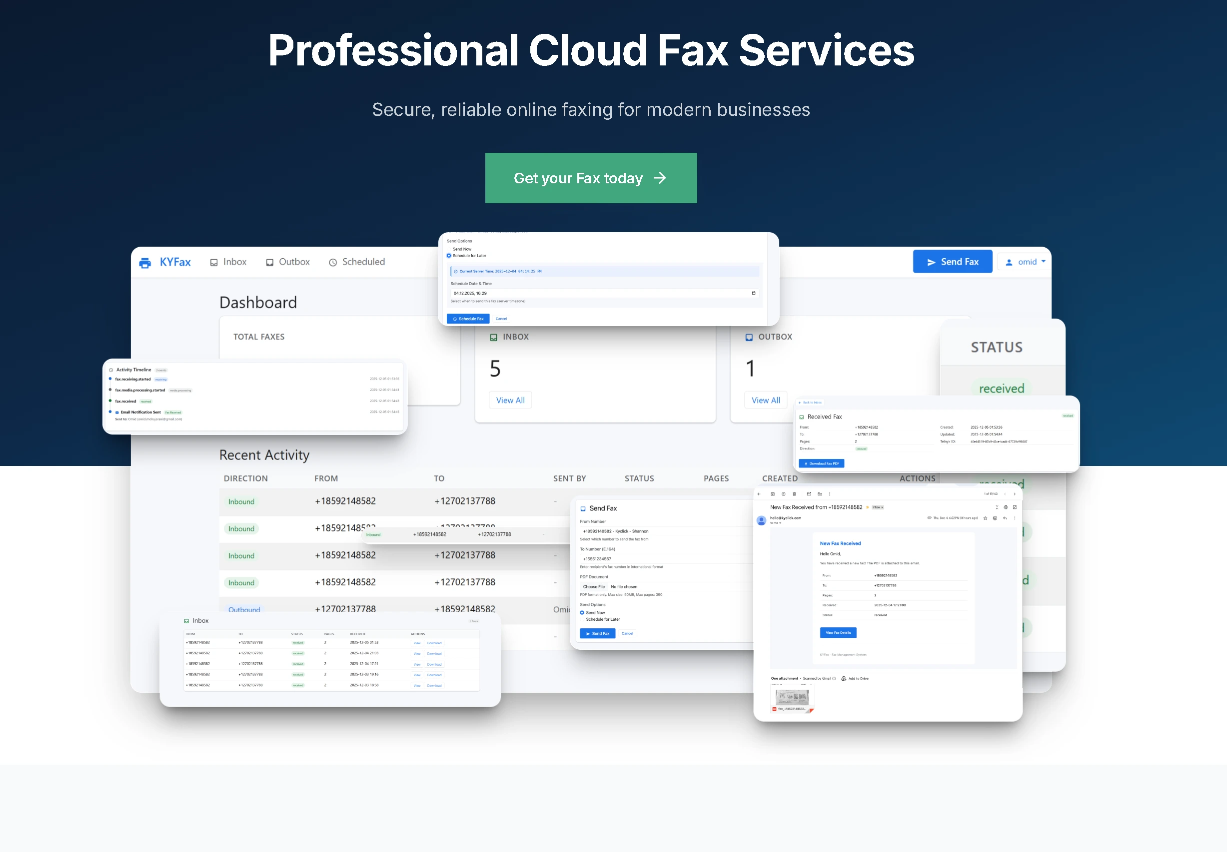
UI Showcase
Key screens from the redesign — homepage, cloud fax, pricing, and features.
Product Improvements
Product value understandable within the first screen
Services easier to discover without technical telephony knowledge
Faster path to understanding core products
Simpler messaging for non-technical business owners
Clearer navigation and focused next steps across pages
Key Takeaway
Simplifying a technical product isn't about removing information — it's about helping users understand the right information at the right moment.
The redesign focused on reducing friction, clarifying product structure, and making cloud telephony feel more approachable for small business owners.